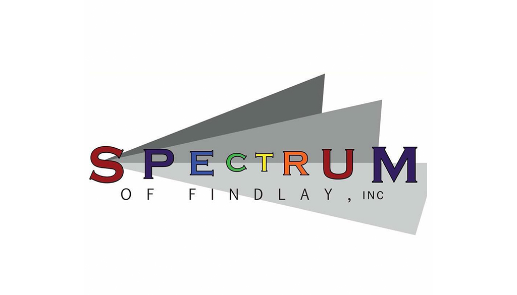
The client wanted a solid logo that represented their nonprofit as a professional establishment to be taken seriously in Findlay. We utilized some aspects from their previous logo as an homage to their origin, but modernized it.
After we created their main logo, they wanted a logo to represent their biggest event, Findlay Pride. This logo utilizes the same design concept as their main logo to connect the brand, but adds its own unique twist with the colored gradient.